1999
Client:
Confidential
Studio:
Warren and Mahoney
Year:
2023
Location:
Auckland
Services:
Creative strategy
Design direction
Brand identity
Experiential strategy
Interior design
Digital activation
Art direction
Signage and wayfinding
Confidential
Studio:
Warren and Mahoney
Year:
2023
Location:
Auckland
Services:
Creative strategy
Design direction
Brand identity
Experiential strategy
Interior design
Digital activation
Art direction
Signage and wayfinding
We were tasked with creating a spatial identity for
a mixed-use property in midtown Auckland. Once a vibrant community hub, the
environment has lost its energy and character.
We approached the branding for this project through
a spatial experience lens. Our objective was to revitalise midtown by creating
an inspiring visual identity that embraced the complexity of the space, the
diversity of its users, and the city's progressive trajectory.
Drawing
inspiration from the building's history, we named the development '1999,' the
year it opened. Our aim was to transform 1999 into a cultural melting pot, a
central symbol of social identity, and a reason to come back to the city.

The building was about to
undertake a refurbishment that would simplify the user journeys and reconfigure
its core functions. With distinct zones across four levels, including a food
court, retail area, cinema, bowling alley, and arcade, effectively
communicating the different offerings in this architecturally complex space
required a unique branding approach.
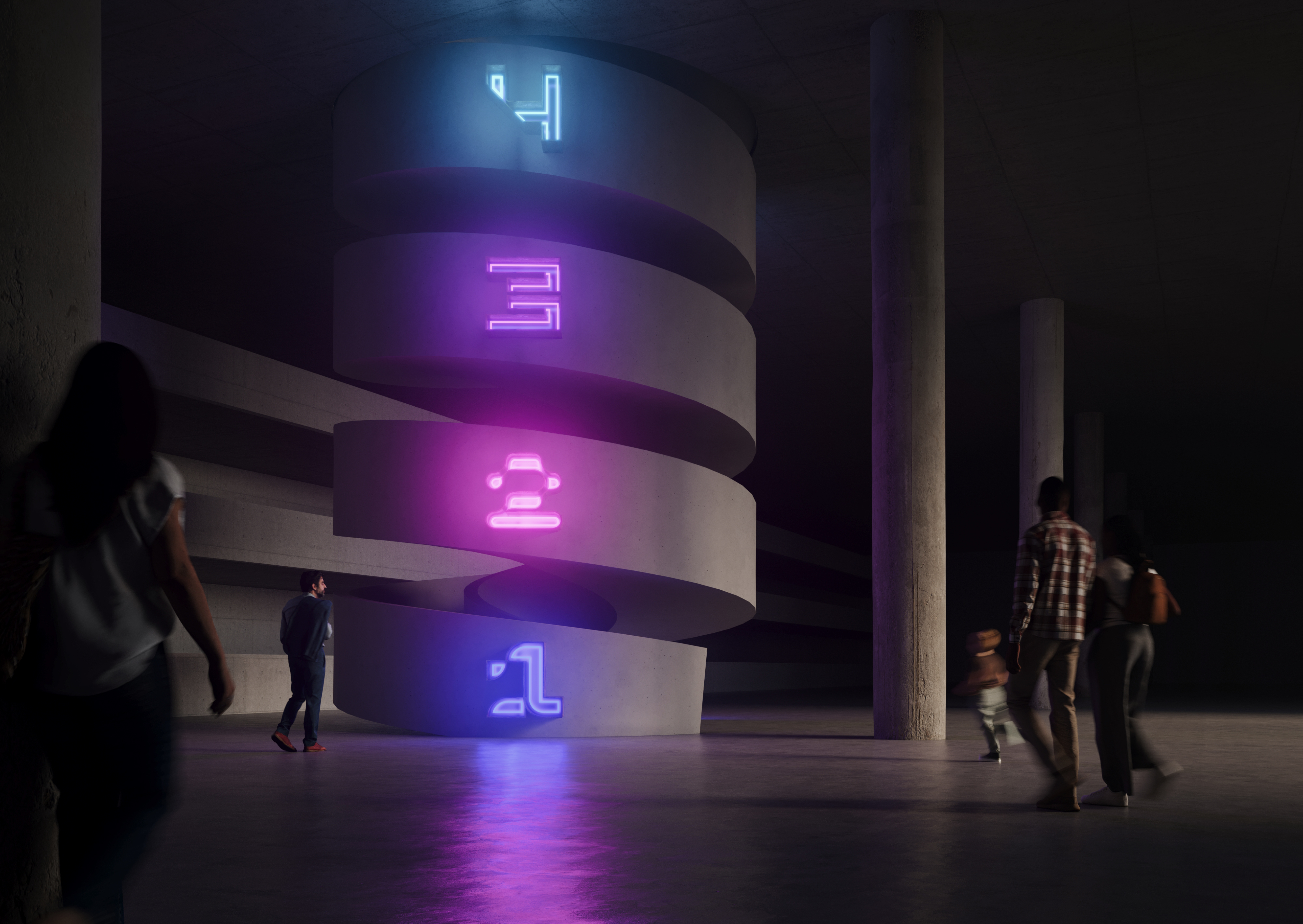
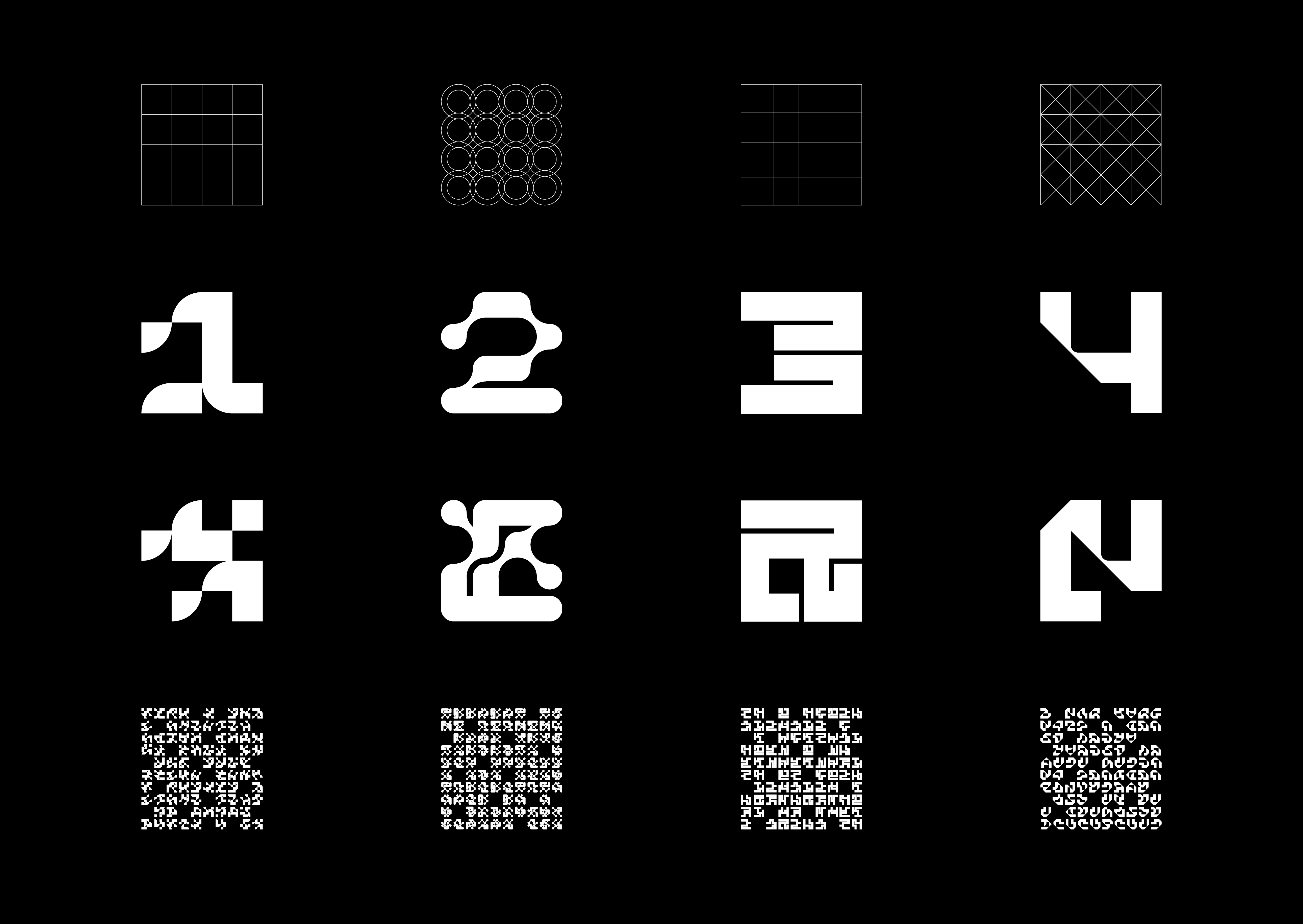
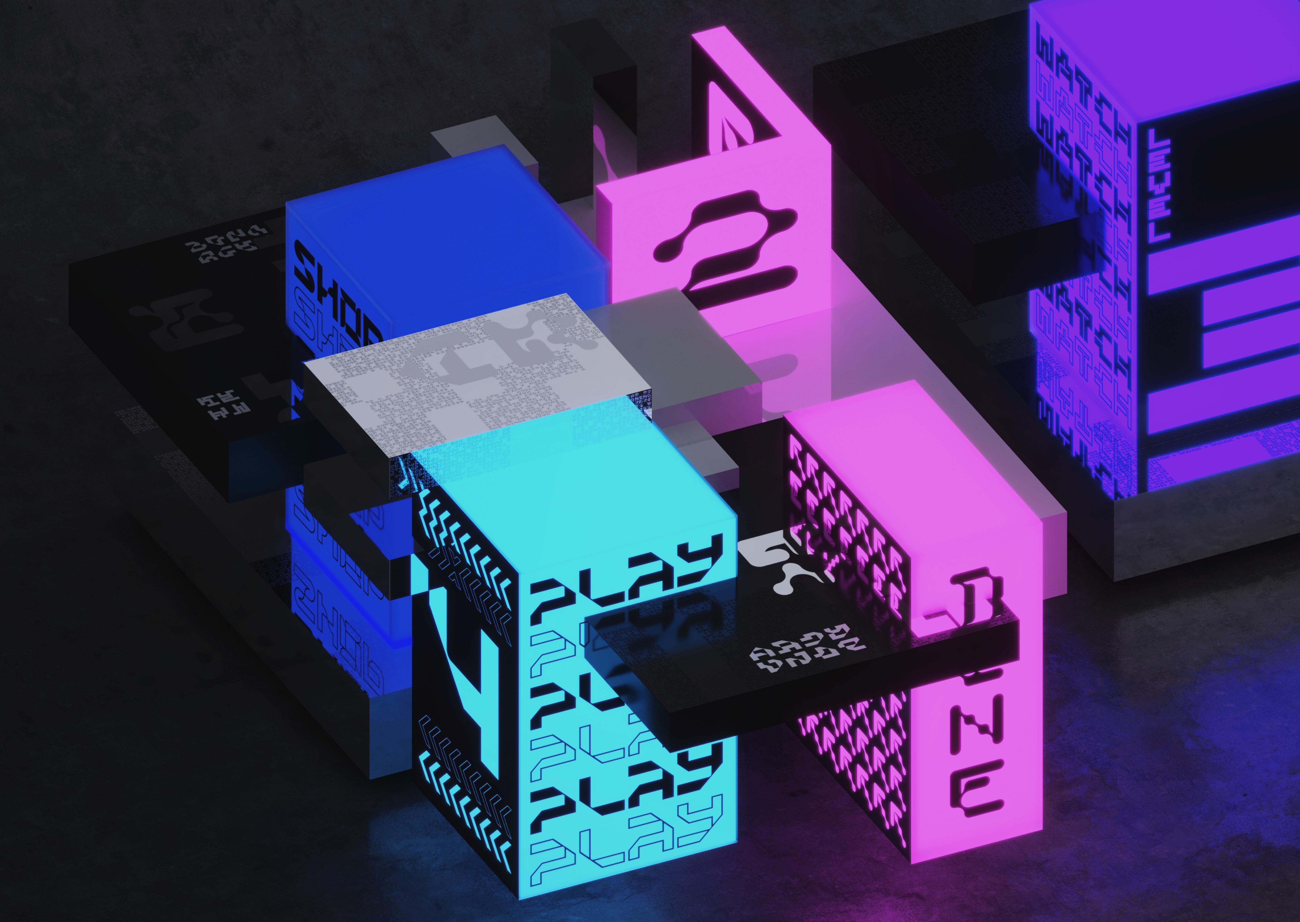
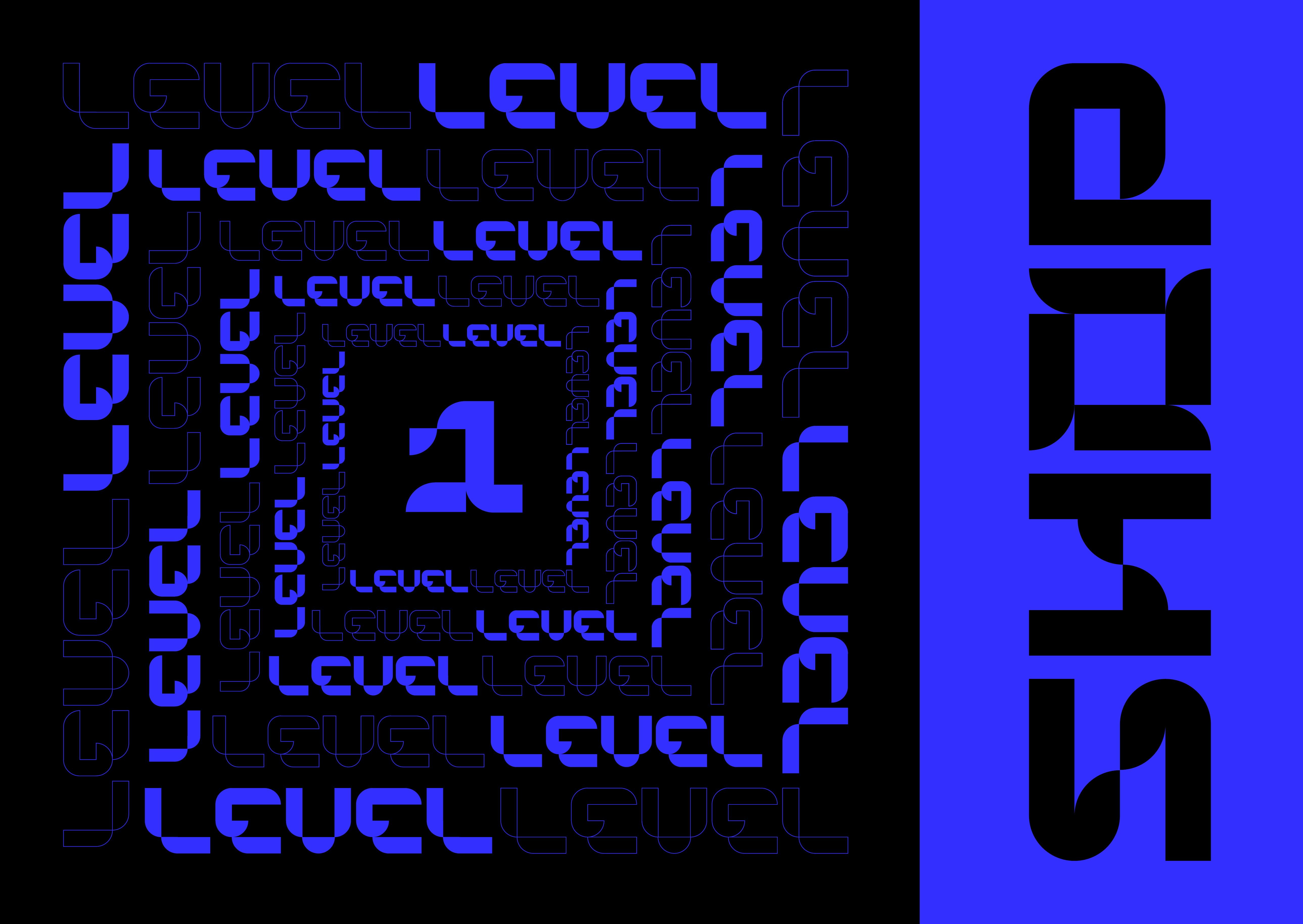
Our strategy focused on the collision of four distinct experiential zones rather than solely on the name. '1999' serves as an authentic stamp of its past, while the real magic lies within the injection of fresh energy and purpose. We named the four zones simply based on the activities visitors would engage in: Shop (level 1), Dine (level 2), Watch (level 3), and Play (level 4). Each zone received its own unique brand identity, featuring a bespoke typeface, matching pattern forms, and a vibrant colour palette.
Our strategy focused on the collision of four distinct experiential zones rather than solely on the name. '1999' serves as an authentic stamp of its past, while the real magic lies within the injection of fresh energy and purpose. We named the four zones simply based on the activities visitors would engage in: Shop (level 1), Dine (level 2), Watch (level 3), and Play (level 4). Each zone received its own unique brand identity, featuring a bespoke typeface, matching pattern forms, and a vibrant colour palette.
These identities stand alone to showcase the activities and
guide users throughout their journey in the space. The identity acknowledges that
the boundaries between zones may sometimes blur, and it is in this experience that
the essence of 1999 is captured—through the coming together of different
identities and ideas.
We drew inspiration from arcade games, cinematography, and the atmosphere of food courts and retail spaces. Vibrant colours, lighting, and chrome finishes contrast with the raw materials of concrete, steel and glass to create a brand that is both vibrant and authentic. Zonal identities are resolved through a form-based grid system, referencing the complex array of shapes within the development. The repetition and layering of these forms create a dynamic, live, and activated system.
We drew inspiration from arcade games, cinematography, and the atmosphere of food courts and retail spaces. Vibrant colours, lighting, and chrome finishes contrast with the raw materials of concrete, steel and glass to create a brand that is both vibrant and authentic. Zonal identities are resolved through a form-based grid system, referencing the complex array of shapes within the development. The repetition and layering of these forms create a dynamic, live, and activated system.

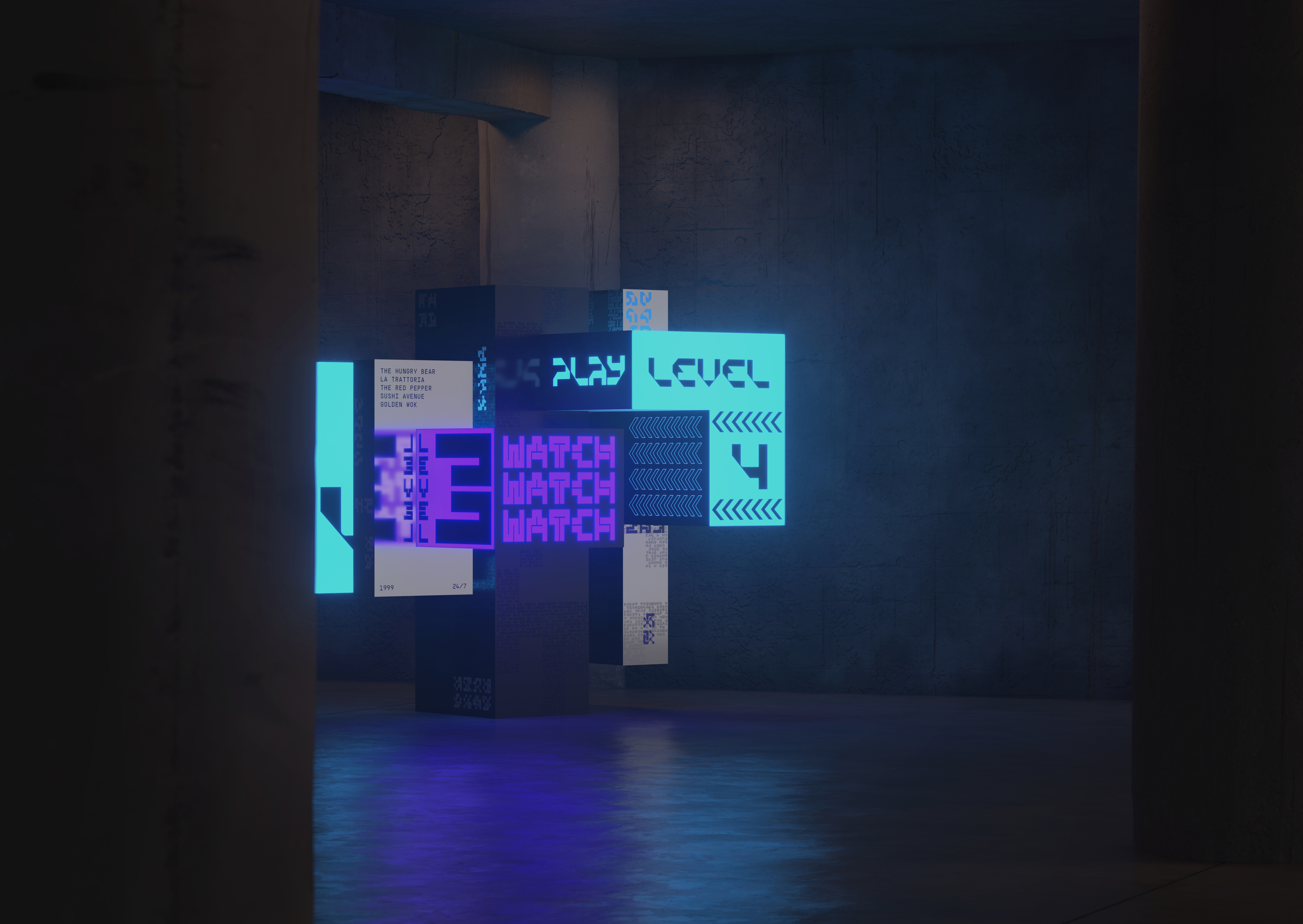
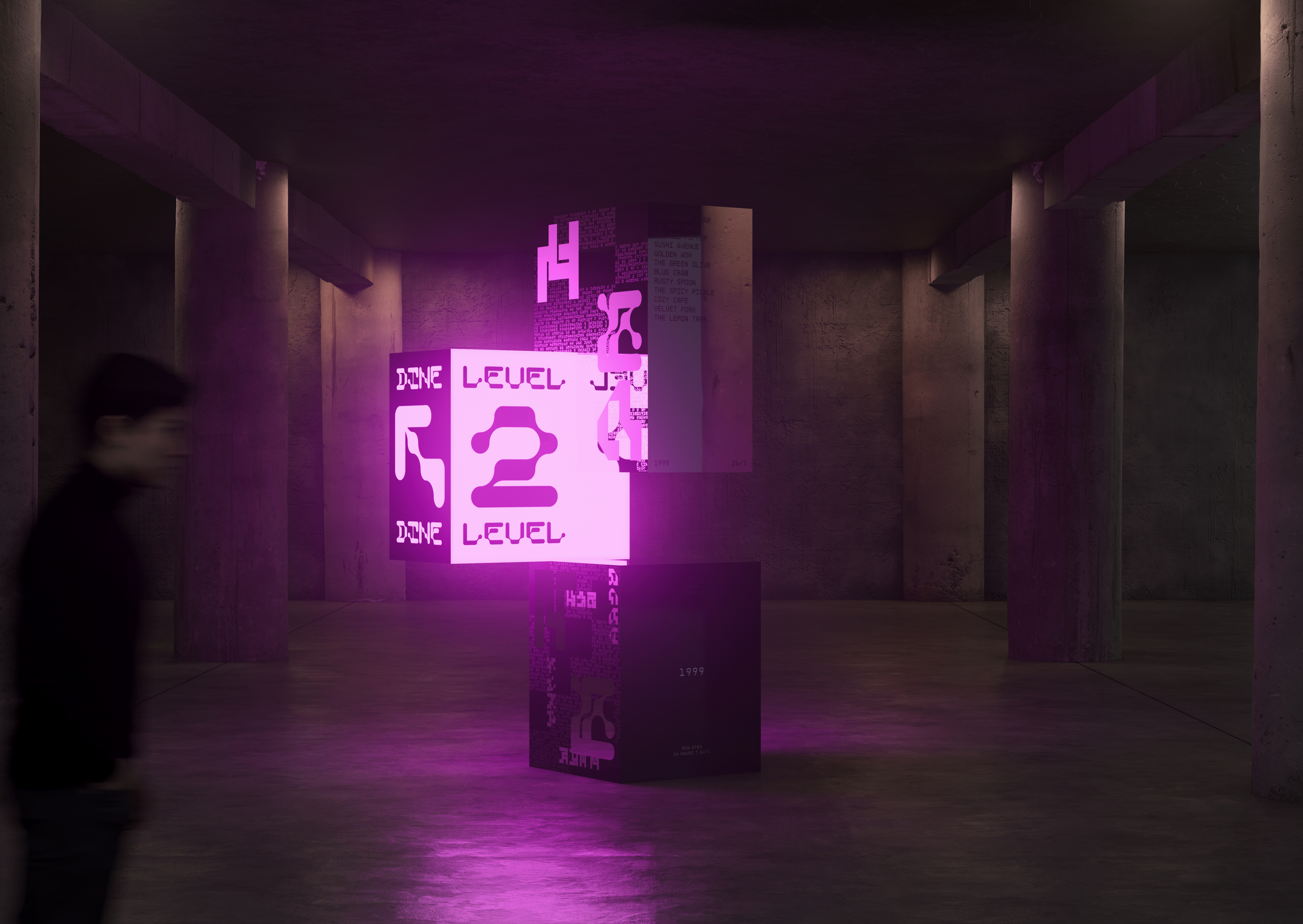
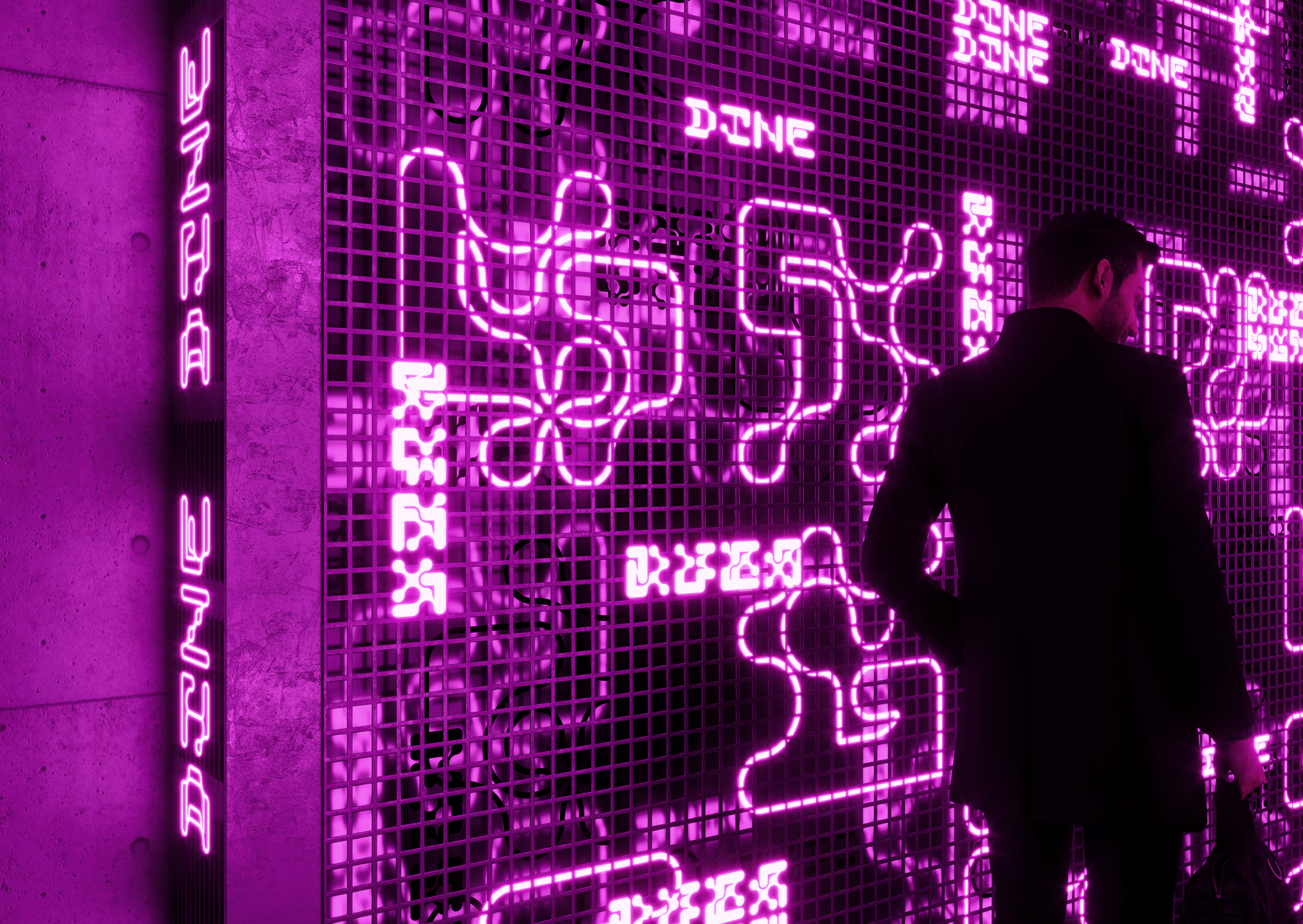
Instead of relying on traditional digital or print
activations, the brand is expressed through an enigmatic representation of the
physical experience. It doesn't showcase the food or products for sale, the
games to play, or the movies to watch. Instead, the brand serves as a beacon,
enticing people to personally engage and participate in the experiences on
offer. Using high-quality digitally produced renders, we capture the textures,
grandeur, and raw materials of the environment. This approach creates a
remarkably adaptable brand that can be deconstructed and reconstructed in
limitless configurations to result in an immersive, tangible, and ever-evolving
identity.
The brand was developed prior to the property's return to market, but it represents a window of opportunity for the future energy of Auckland City.

